Whether you’re a small start-up or an mahousive enterprise, you probably have something in place to explain how you work. We call these terms of business, or TOBs if you like that kind of thing (we do). For some people that’s just a few bullets in an email, for others it’s a scrappy word doc, and for others it’s pages and pages stuffed with ‘heretofores’ and ‘herebys’. But does anyone ever actually read your terms? And does it matter if they don’t?
Your terms should be understandable
This may sound like a very basic rule, but there’s a common misconception that TOBs don’t have to make much sense, they just have to exist. Feeling overwhelmed by legalese, time-poor business owners sometimes download a template, make some tweaks and crack on with whatever’s next on their to-do list.
The trouble is that your terms of business are supposed to be a contract between a seller of goods or services (you) and their customer or client (your user). They set out the relationship between the two and, once agreed, both sides have to abide by them. Simple, right?!
Well, yes and no. As you’re very much aware, no two companies are exactly alike – especially if you’re a start-up or scale-up with a totally new idea or business model. So if your terms are opaque, convoluted or simply not that relevant, then things can get a little sticky when you need to refer to them if – for example – something goes wrong. And since the whole idea is to clarify these potentially messy situations, it’s vital that everyone understands the terms. If your TOBs aren’t clear and concise, they’re not doing their job.
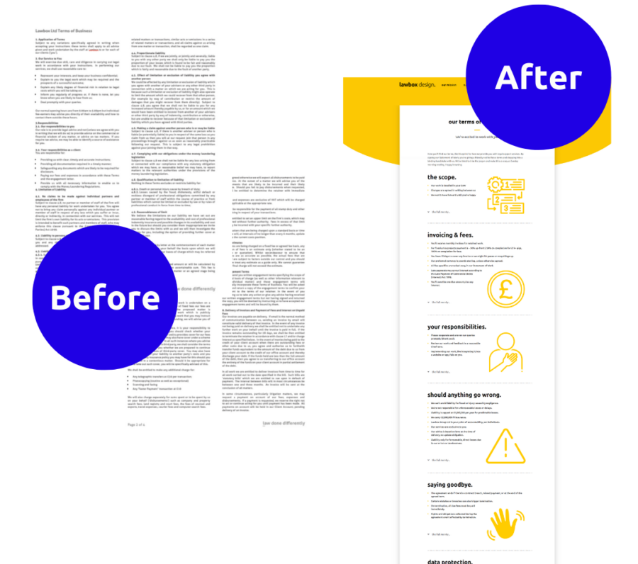
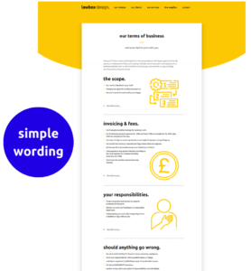
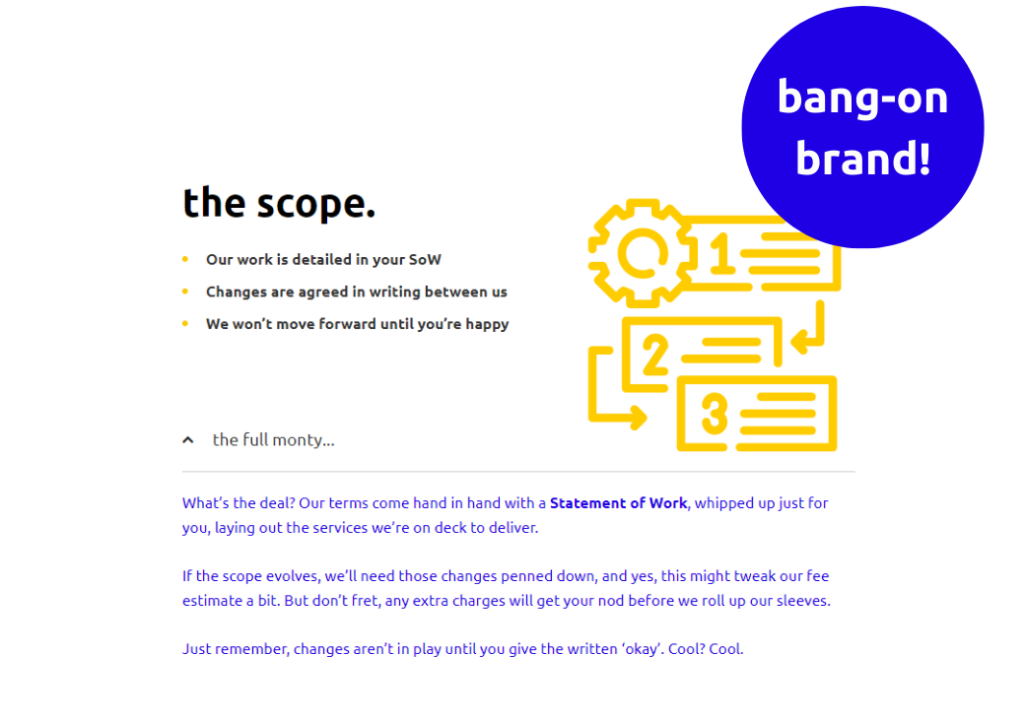
The Lawbox way: Any terms we create are written in ordinary language and leverage UX best practice, such as utilising blank space, bullet points and interactive formats to make the info more digestible. You can see this in action in the image above, which shows how we’ve stripped our terms of business right back and used dropdowns where extra detail is needed.
Your terms should be engaging
Of course, your terms of business need to be compliant with the law and enforceable if needs be. But this doesn’t mean they have to be written in ways only a solicitor can decipher. Indeed, if you do end up entering into litigation – yikes – you’ll be at risk of your terms being deemed too ambiguous or incomprehensible.
So, what’s the best approach? You may be spotting a theme, but our advice would be to focus on your user. If they get bored of your terms halfway through, then you’ve entered into a contract with someone who doesn’t know what they’ve signed up for. And that usually means disappointments, frustrations and potential misery for all involved.
If you can keep your customer’s attention, however, by varying the pace, breaking up the text with icons and possibly even throwing in a few images or illustrations, then they might just make it all the way to the end. And your relationship will be set up for success from the get-go.
The Lawbox way: Whoever said a picture tells a thousand words was really onto something. They probably should have trademarked it, but that’s another story. Anyway, there’s no law against adding some visuals to your documents, or keeping sentences short, or using words that won’t send the average person to sleep. That’s why you’ll see our TOBs, above, look and sound pretty nifty.
Your terms should suit your style
Ok, this might sound like a totally optional, maybe even frivolous one – but anybody who is passionate about their brand will get why it matters. Because you didn’t spend late nights and caffeine-fuelled mornings building your business just so it could blend into a sea of sameness. You did it because you believe in your product or service and you want to share it with the world at every opportunity.

When you have all that passion, why would you ever want to give your users a ‘meh’ experience? Most of the entrepreneurs and directors we speak to want every touchpoint to convey their values. They do this through their visual guidelines and tone of voice. But then, when they come to create their terms of business or any other contract they just – what – give up? We cannot let this happen. With the right support, you could have documentation that mixes seamlessly with your marketing and gives your customer yet another reason to believe in you. If only there was a legal consultancy that could help…
The Lawbox way: We’re a collective of legal experts, creatives and even UX designers who can rustle up terms to suit your style, visually and verbally. Alternatively, our solicitors can work directly with your team, helping to draft, edit and ratify what you create, using whichever tech you prefer. Our own tone of voice is ‘clear, direct and cleverly irreverent’ and while we’ve dialled down the irreverence in some sections of our TOBs, it’s still there, partying in the dropdowns. It’s a makeover that matches our brand, and you could have one too.